Dynamic Side-Navigation
Table of Contents
Gone are the days of static, boring table of contents lists that leave users scrolling endlessly through your content. Today's users expect intuitive, interactive navigation that guides them exactly where they need to go — and this Dynamic Table of Contents component delivers that fully flexible experience that you can add to your own site, in seconds.
Purchase the component here (from $4.99)
Three Powerful Interaction Modes
Click menu mode (New - Shown Left)
Inspired by Substack's side-menu.
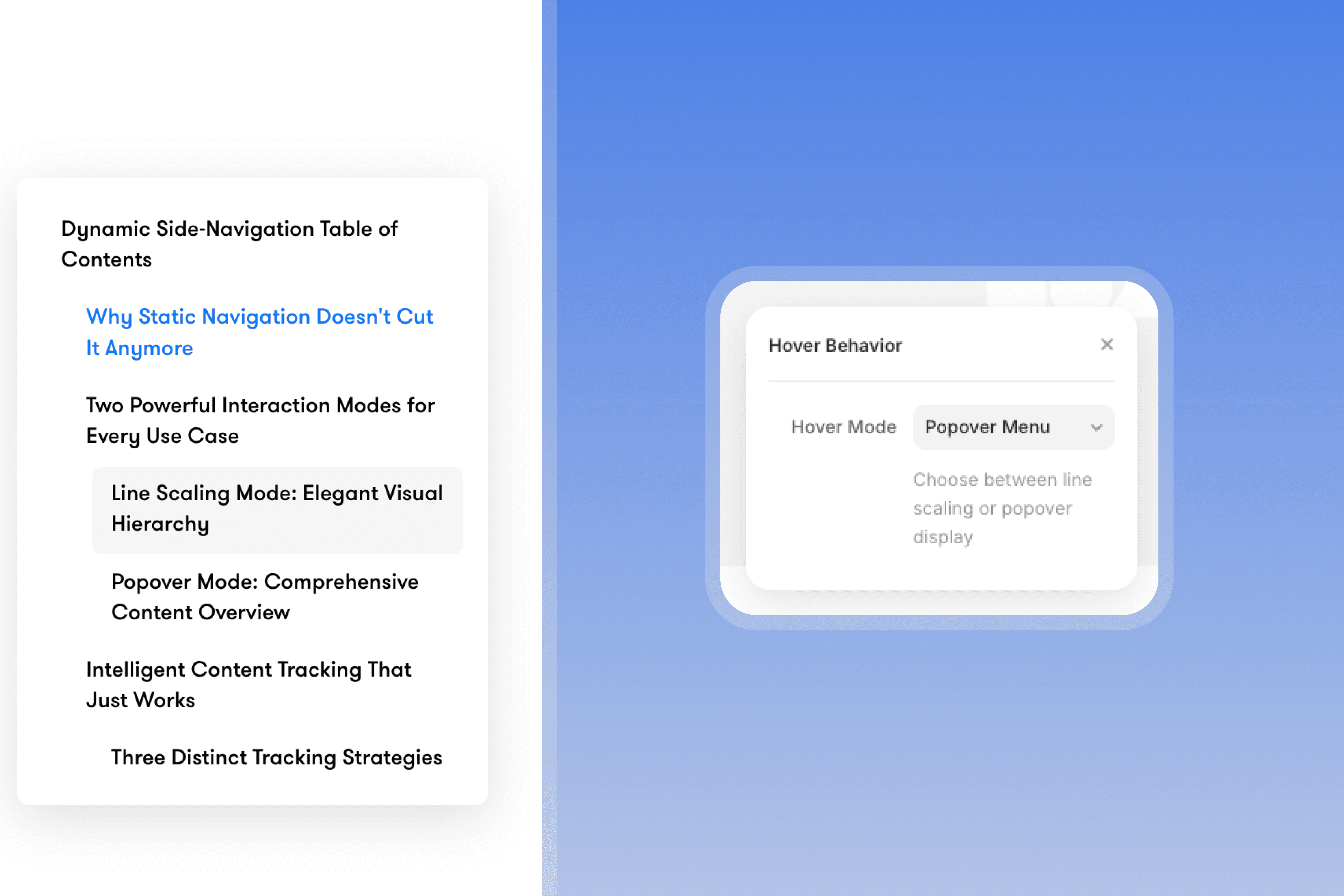
Popover Mode
Inspired by Notion's side-menu.
When you need to display extensive navigation in a clean, organized way, popover mode reveals a beautiful menu overlay on hover. Perfect for long-form content, documentation, or any situation where you want to show the complete content structure without cluttering your design.
The popover appears with Apple-inspired animations—subtle sliding motion, refined timing, and elegant opacity transitions that feel native to modern interfaces. Users can see their entire content journey at once while maintaining the minimal visual footprint of simple lines.
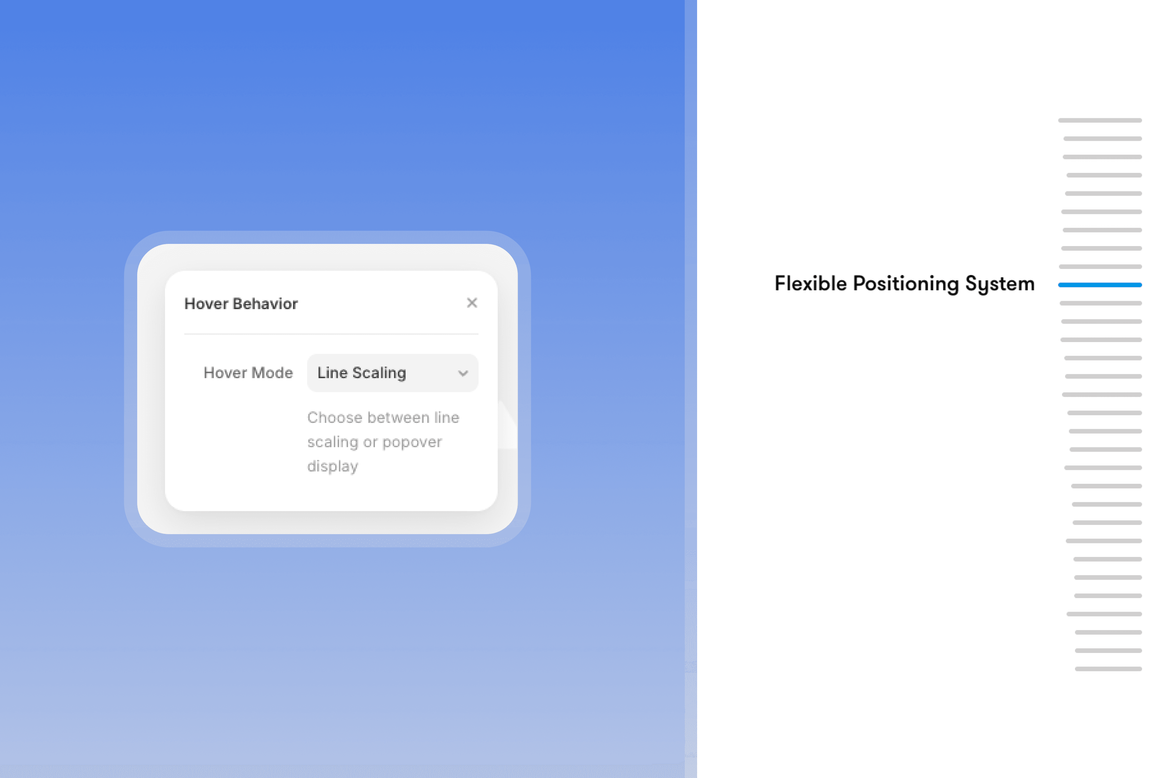
Line Scaling Mode (Shown right)
Perfect for minimal, focused navigation experiences. When users hover over navigation elements, lines dynamically scale based on proximity to their cursor, creating an elegant visual hierarchy that feels both sophisticated and intuitive.
The hovered item expands to full width while nearby items scale proportionally, creating a smooth curve effect. You control the visual impact with curve intensity settings—from subtle scaling (0.1) for minimal designs to dramatic scaling (1.0) for bold visual statements.
Note: Background overlay effect uses a secondary element which must also be on the page to work (included in the remix file).
Intelligent Content Tracking That Just Works
Three Distinct Tracking Strategies
All Headings Mode automatically scans your page for H1-H6 elements, creating navigation that respects your content hierarchy. The component intelligently handles different heading levels—H1s get full width, while H2s and deeper headings scale proportionally, creating natural visual hierarchy.
H1 Elements Only focuses on major sections for cleaner navigation. Perfect when you want to highlight main topics without overwhelming users with subsection details.
Custom Scroll Sections gives you complete control over navigation points. Define specific areas using simple ID patterns (toc-section-1, toc-section-2) for landing pages, presentations, or any content where traditional headings don't match your navigation needs. Note: section IDs must be prefixed with "toc" for this to work.
Exclude Selectors: Control What Appears in Your TOC
Sometimes you have headings on your page that shouldn't appear in the table of contents—like a hero section title, testimonial headers, or footer navigation. The Exclude Selectors feature lets you hide these.
How to Use It:
In Framer, every Frame has a Name (visible in the layers panel). You can target it using the data-framer-name attribute.
What you want to exclude | What to type |
|---|---|
Frame named |
|
Frame named |
|
Multiple sections |
|
Step-by-Step:
In Framer, select the container (Frame) that holds the headings you want to exclude
Look at the Name field in the layers panel (e.g., "Hero Section")
In the TOC component's "Exclude Selectors" field, type:
[data-framer-name="Hero Section"]For multiple exclusions, separate with commas:
[data-framer-name="Hero Section"], [data-framer-name="Footer"]
Important: The name must match exactly, including spaces and capitalization.

Smart Heading Hierarchy
In popover mode, the component creates beautiful indentation that reflects your content structure. H2s indent slightly, H3s indent further—your entire document hierarchy becomes visually clear at a glance. Users understand not just what sections exist, but how they relate to each other.
Complete Visual Customization for Any Brand
You can customize pretty much everything you see. Need to unlock additional customisability? Just reach out to me at danmarek@outlook.com and I'll add it for you for FREE.
Flexible Positioning System
Position your navigation on either side of the screen with a single toggle. The component intelligently adjusts animations, hover behaviors, and popover positioning to work perfectly in any layout. Labels and popovers slide from the correct direction, maintaining natural interaction patterns.
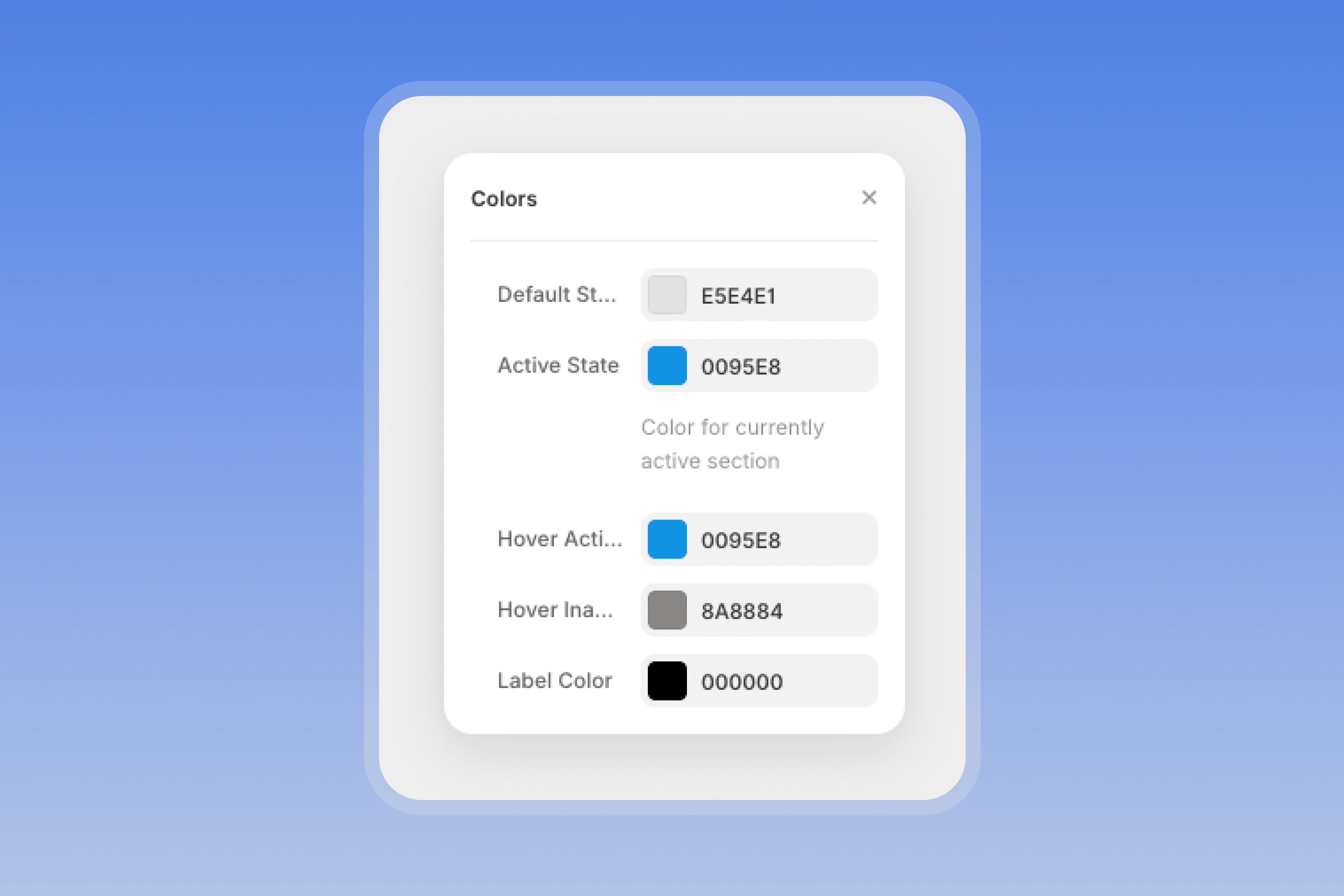
Rich Color System That Adapts
Five distinct color states ensure your navigation works in any design context:
Default state for inactive navigation items
Active state highlighting the current section as users scroll
Hover active for the primary item under interaction
Hover inactive for secondary items during hover
Label color for all text elements
Advanced Popover Styling
When using popover mode, you get complete control over the menu appearance:
Background colors with automatic backdrop blur effects
Border radius for brand-appropriate corner styles
Padding and spacing to match your design system
Width and height constraints for perfect content fitting
Item hover states that feel responsive and polished
Apple-Inspired Animation Excellence
Refined Motion Design
The component's animation system takes inspiration from Apple's interface guidelines—quick but smooth timing, subtle sliding motions, and elegant opacity transitions that feel native to modern devices.
Default animation settings use Apple's signature 0.25-second duration with easeOut curves, but you can customize every aspect:
Initial and final opacity for perfect fade effects
Slide distances with precise pixel control
Animation timing from snappy (0.1s) to luxurious (2s)
Easing curves including Apple's signature easeOut and advanced options
Micro-delays for that extra touch of polish
Seamless Performance
Every interaction feels instantaneous. The component uses efficient DOM observation and optimized Framer Motion animations that won't impact your page performance, even with complex content structures.
Enhanced User Experience Features
Active Section Tracking
The component intelligently tracks which section users are currently reading, automatically highlighting the corresponding navigation item as they scroll. This visual feedback helps users understand their progress through your content without any manual interaction.
Smooth Scroll Navigation
Clicking any navigation element smoothly scrolls to the corresponding content section. The configurable scroll offset accounts for fixed headers or positions content exactly where you want it relative to the viewport.
Smart Hover Areas
Invisible hover zones extend beyond the visual lines, making navigation effortless on any device. Users don't need pixel-perfect cursor precision—the component responds to natural interaction patterns and accommodates touch interfaces beautifully.
Perfect for Any Content Strategy
Long-Form Editorial
Transform blog posts and articles into scannable, navigable experiences. The heading hierarchy creates natural reading progression while active section tracking shows readers their progress through your narrative.
Technical Documentation
Make complex information accessible with comprehensive navigation that adapts to your content structure. Users can jump between concepts while maintaining context of how topics relate to each other.
Interactive Presentations
Create guided experiences through landing pages and product showcases. Custom scroll sections let you define narrative waypoints that don't follow traditional heading patterns.
Implementation in Minutes, Not Hours
Zero-Configuration Content Discovery
The component automatically scans your content and creates appropriate navigation. No manual setup, no complex configuration—just intelligent content discovery that works with any structure.
Smart Label Override System
Need navigation labels that don't match your heading text? The override system lets you define custom names for each section while maintaining automatic scroll functionality. Perfect for creating user-friendly navigation that speaks your audience's language.
Future-Proof Flexibility
As your content evolves, the component adapts automatically. Add new sections, modify headings, or restructure your content—the navigation updates instantly without any manual intervention.
Ready to transform your content navigation? The Dynamic Table of Contents component turns every piece of long-form content into an engaging, navigable experience that keeps users oriented and engaged. With two distinct interaction modes, intelligent content tracking, and complete visual customization, it's the navigation solution your content deserves.
Add the component to your Framer project today and discover how sophisticated navigation can transform user engagement with your content. No code required, just better experiences.